Various Artists
Andy Marino Music
I was delighted when my talented singer-songwriter friend Andy Marino approached me to design the packaging for his debut CD, Everything’s Different. We began the project by discussing a wide range of solutions for expressing his vision of the CD and the feel of his songs, then researched hundreds of classic folk, jazz, and pop album covers for inspiration. Ultimately we settled on using a series of pinhole portraits I’d taken of Andy several years ago, using one of the them for the cover and three others for the inside and the CD itself. The story we told with the photos was one of movement, change, and disruption — an idea powerfully expressed in the CD’s title song.
After completing the CD design Andy subsequently also hired me to design a new website to showcase his music, promote the CD and his gigs, and link to sites where the CD is available for sale and listening (Amazon, CD Baby, Bandcamp, iTunes, and Spotify). To keep costs down we elected to use Squarespace, using one of their simple but powerful musician themes. The site offers users the opportunity not just to read about Andy’s impressive music background (he played sax in multiple bands including, in the late 1980s, Francis Xavier & the Holy Roman Empire, voted the year’s “Best Original Rock Band in NYC”) but also to listen to all the songs on Everything’s Different.
Check out the website here and listen to Andy’s wonderful music!
Additional CD Packaging Design:
Extensive Enterprise
As fortune would have it, my first project as Red+Company was a CD cover for the very talented Tony Moore called In the Red. Tony teamed up with members of the alternative rock band Sponge to record a fantastic, heartfelt, and full-on metal album of love songs, breakup songs, drinking songs, and just loud songs. Look closely at the album art and you’ll variously see sound waves, accounting charts (Tony works as as accountant when he’s not making music) a molten metal furnace, or two facing silhouettes. Check out In the Red wherever loud music is sold.
Julia Haltigan
When New York songstress Julia Haltigan approached me about taking a pinhole portrait of her for the cover of her new EP, Hot Tears, I jumped at the chance. She’s an enormously talented singer, songwriter, and performer who has built a strong following for her evocative mix of country, rock, and punk. Check out this recording of her fantastic song Goodbye Cowboys and Rocketmen!
Julia grew up on Manhattan’s Lower East Side and wanted the portrait to have a distinctively New York look, so I took the photos in her old haunts near the corner of Ludlow and Rivington. We split the shoot into two sessions — one to cast a wide net and review the results, another to zero in on the best results and improve upon them. Pinhole photography is a crapshoot process, with little way of knowing exactly what you’re getting until the film is processed, so having two sessions gave us a chance to zero in on what we wanted. In all I took 120 portraits of Julia, from which she selected one taken in the stairwell of her childhood apartment building.
I ended up also designing the cover for Hot Tears, working closely with Julia and her photographer boyfriend Marc McAndrews as we explored fonts, colors, and compositions. The result is a simple and classic design that references the covers of many great New York albums from the 1970s.
Carol Lipnik
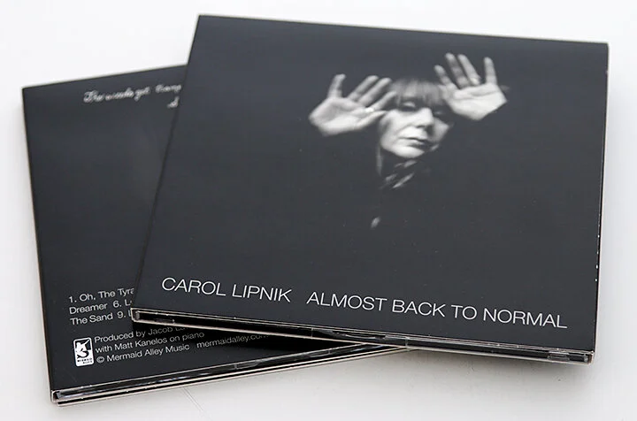
Coney Island native Carol Lipnik approached me while working on her 2014 CD, Almost Back to Normal, to ask if I could take a pinhole portrait of her for the cover. She wanted a moody and etherial portrait to accompany her haunting and humorous songs and thought a pinhole photo would work perfectly. We discussed her ideas and quickly agreed to work together.
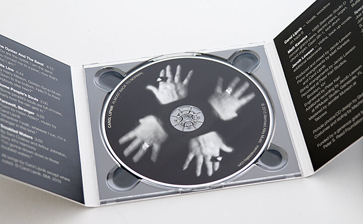
I took 120 portraits of Carol over the course of two lengthy sessions in my Dumbo, Brooklyn studio. We worked quickly and loosely with the props and costumes stylist Machine Dazzle brought, casting a wide net as we explored the humorous, weird, and beautiful ways they contributed to the characters and moods in Carol’s songs. Hands figured in many of the portraits, partly because they are so expressive but also because of ways in which they played off of words and images in the music.
To my delight I also ended up designing Carol’s CD. We explored a handful of the portraits and eventually settled on five for a design that draws on some of the classic album covers of the 1960s and 1970s New York City music scene.
“What separates Ms. Lipnik from every other conjurer of the otherworldly is her phenomenal voice. With a four-octave range, impeccable pitch and several distinct personalities within that voice, Ms. Lipnik evoked singers as disparate as Diamanda Galás, Maude Maggart, Yma Sumac and the yodeling Joni Mitchell. Her instrument is, in a word, phenomenal.” —Stephen Holden, The New York Times


